October 4, 2009
Hello everyone. I am Ruben Infante, Director of User Experience at PhatDeals. In this three-part series, I will discuss the thoughts and processes behind putting together a complete site redesign.
For a good portion of the last year I have been busy putting together what is now the public beta of PhatDeals 1.0. I hope you are all enjoying the new layout, but I wanted to shed some light on what happened behind-the-scenes to get everything up and running. Taking the strengths of the previous site and addressing its potential downfalls, while giving everything a new coat of paint can be slightly complicated. Especially considering that we wanted to keep a large portion of the infrastructure in place and simply build around it. This endeavor was going to take some planning in order to ensure that I had the right idea of where the site needed to go.
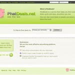
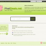
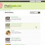
I started working for PhatDeals officially in February of 2009 after some initial meetings with the team. They presented me with the task of giving them some ideas of what I thought we could do to improve the usability of the site. I came back with a few basic mock-ups. The ideas were simple modifications that I felt would improve usability. For example, I suggested we take what was a location drop down menu on the home page and convert it into a zip code search bar. Another idea was allowing users to hover over deals and click anywhere to access more information. As inelegant as the mock-ups were, the team decided they wanted to move forward. I was excited about the possiblities, and in my excitement decided that not only did I want to make minor improvements to the site — I wanted to completely redesign it.
I had quite a few discussions with the team about the feel of PhatDeals and where they wanted to take the site. The core fundamentals that I came away with involved being professional yet fun, having a light and playful personality that is community oriented, and keeping a relatively minimalistic design that is clean and simple. Personally, I had previously tended toward darker designs and something light was going to be a challenge for me. In fact, I hit quite the mental roadblock. I kept making mock-ups of site layouts but I was not able to create anything that enjoyed looking at. I decided I was a bit too ambitious in my approach and that I would have to back up and start with something smaller.
The logo. I needed to change it. It was one of the factors that I did not find was lending enough toward the playfulness that the team had requested. The original logo was a traditional piggy bank with some low-profile button eyes and the brand name as a string of text to the right. I really liked the style and concept of the logo but it needed more life. I did what any self-respecting graphic designer would do and headed to the internet for some inspiration.
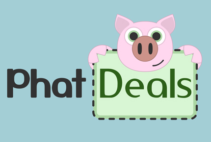
I looked through countless images relating to pigs, piggy banks, deals, coupons, and phat. The first thing I came across was an image of an actual piggy bank, but looking straight at the face. Not a common perspective, but intriguing nonetheless. I did an outline of the features. I realized early on that taking reality and directly translating to cartoon doesn’t work quite that well, so I made some tweaks here and there. Made the face more symmetrical, created more cartoon-like ears, exaggerated colors, and gave the pig some life with big bright eyes. I liked it, but it was just a face and I still had that pesky text to deal with.
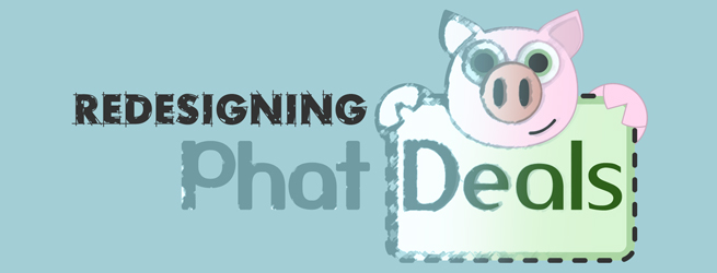
Then it hit me. What if he’s holding a coupon that has the brand name inside? It all just clicked. I quickly made up a coupon shape and drew up some hands to curve around the coupon. It worked well, so I attempted to put all the text inside the coupon. Although it sounded good on paper, it was just too busy and difficult to read. This would only be more apparent in any applications where we had to shrink the size of the logo, such as our actual coupons. I decided to keep only the word deals inside the coupon and bring the word phat out. In the end, I think the coupon border adds a nice distinction beyond the simple color difference in the two words.
I had done it. I redesigned the company logo to be more playful which would open the door to the actual site redesign.
To be continued…
